Client: Peab Bostad, 2023
Enhanced user journey for Peab Bostad
Mission
Peab Bostad, one of Scandinavia’s leading residential developers with over 60 years of experience, approached us with a clear challenge: how can we make the process of finding and exploring a new home more intuitive, engaging, and conversion-friendly? Their existing website struggled with unclear navigation, fragmented tools, and a user journey that didn’t align with the needs of modern homebuyers. We set out to create a seamless, mobile-first experience that simplified decision-making and inspired confidence.
My role
As the lead Product Designer designer in an agile team, I drove the design process from discovery to implementation. Collaborating closely with developers, I crafted a user-centric experience that would not only meet business goals but also make the journey of finding a home smoother and more enjoyable.
Research & Discovery: understanding homebuyers’ needs
To uncover user pain points and opportunities, we conducted an in-depth research phase that included user interviews, surveys, usability testing, competitor benchmarking, and an accessibility audit. We interviewed 10 participants (ages 25-65) who also got to perform a test on the website. The usability test highlighted real-time frustrations, and our competitor analysis provided valuable insights into industry best practices.
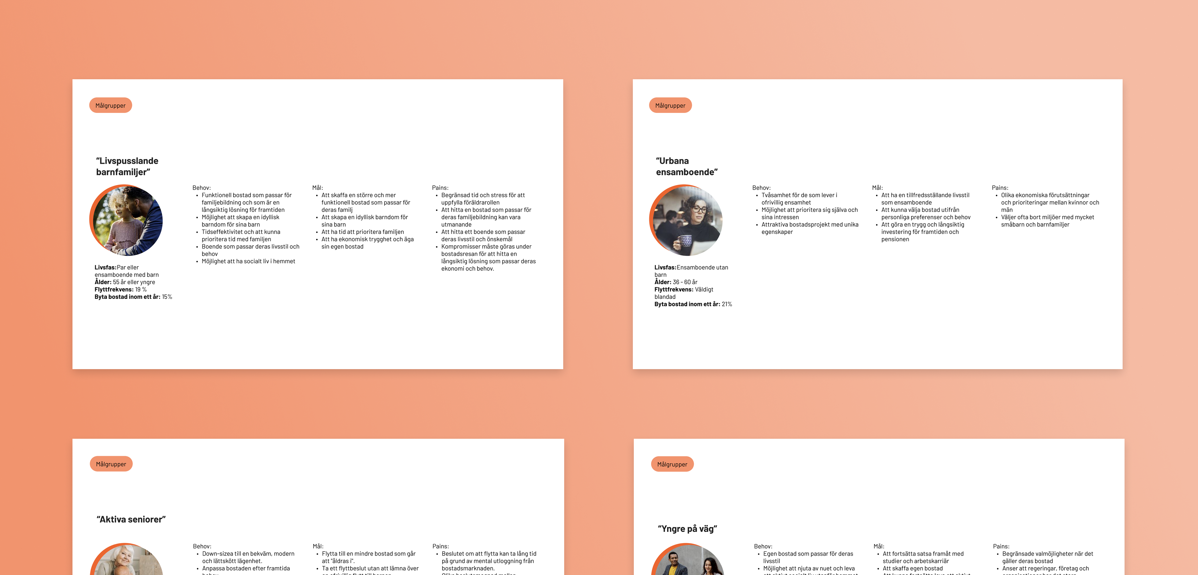
Example of personas
The Challenge: a frustrating user journey
Buying a home is a major decision, yet Peab’s website made the process frustrating. Users struggled with unclear navigation, jumping between tools to gather basic information. Many abandoned the process due to a lack of transparency about available properties.
Our research revealed five key insights impacting the user experience:
1. Poor mobile optimization – navigation and property comparisons didn't work on mobile.
2. Unintuitive navigation – the structure didn’t align with users’ mental models.
3. Inconsistent design – Visual elements and CTAs have inconsistent design and are perceived as unclear.
4. Hard-to-find information – key features and information are hidden or hard to find.
5. Confusion between project and property listings –Users experience uncertainty about whether they are viewing information about a specific project or property and easily get lost.

Designing the solution
To address these usability issues and improve property comparisons, I explored various user flows. I chose a flow that allowed easy navigation between objects without reloading the page, enhancing user experience and encouraging exploration. This solution simplified maintenance, reduced duplicated work for editors, and kept users engaged and focused.
By focusing on users' needs and goals, the modal view minimized the risk of losing users and reduced confusion during comparisons. I then created low-fidelity wireframes to ensure all content was correctly included and placed.
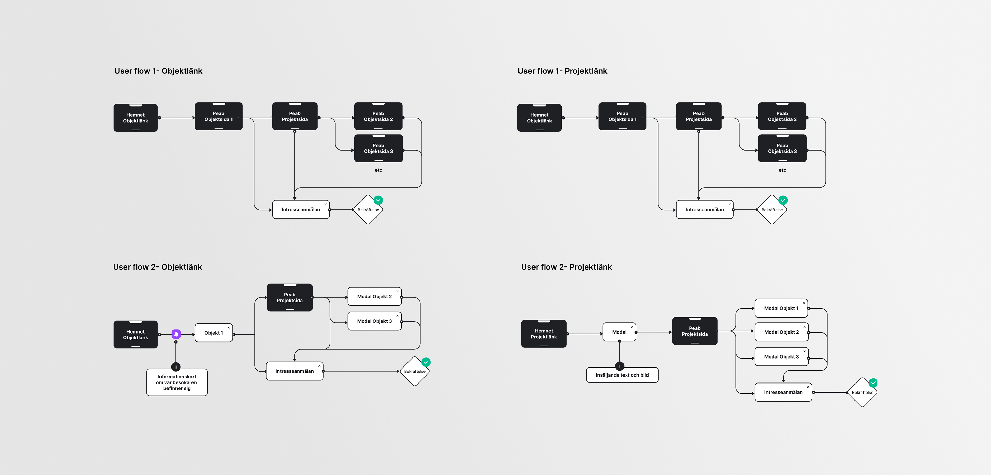
Example of user flow
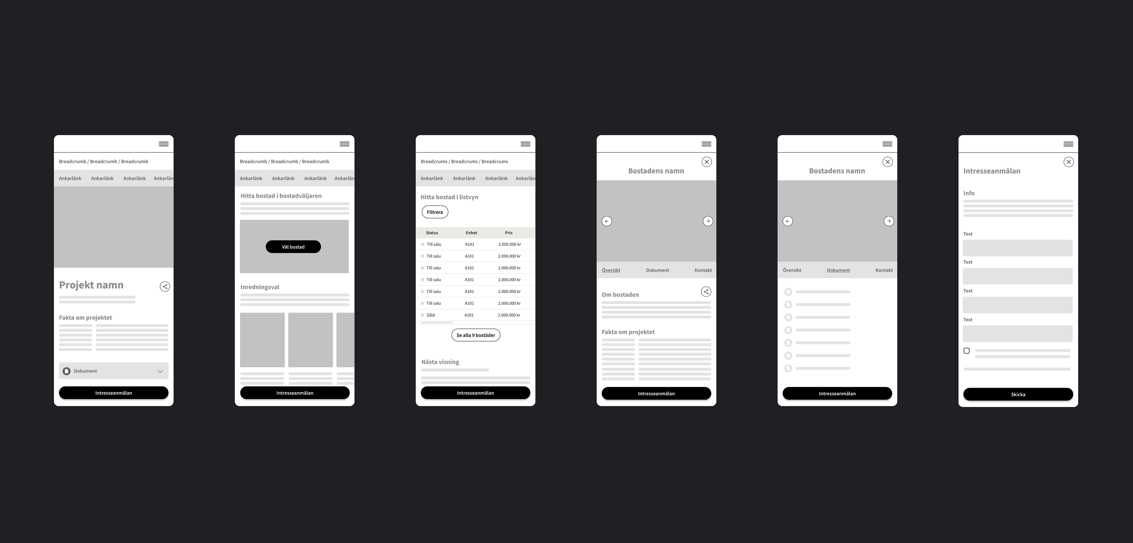
Example of lo-fi wireframes
UI Concept development
Guided by my design principles of clarity, consistency, and user empowerment, I explored various UI concepts, testing different layouts and visual styles to improve usability while ensuring the design aligned with Peab’s brand guidelines.
A key challenge was accessibility. The strict brand manual limited improvements to color contrast and UI elements, making it difficult to meet best practices for readability and inclusivity. I focused on enhancing contrast, refining UI elements, and simplifying interactions. Through iterative testing and collaboration, we found creative ways to improve accessibility while staying true to Peab’s brand identity.

Example of hi-fi wireframes
Building a scalable design system
To future-proof the platform, I developed a design system that standardized components and interactions. This was documented for both designers and developers, ensuring consistency and scalability. The system was implemented in Storybook, allowing for efficient development and maintenance.
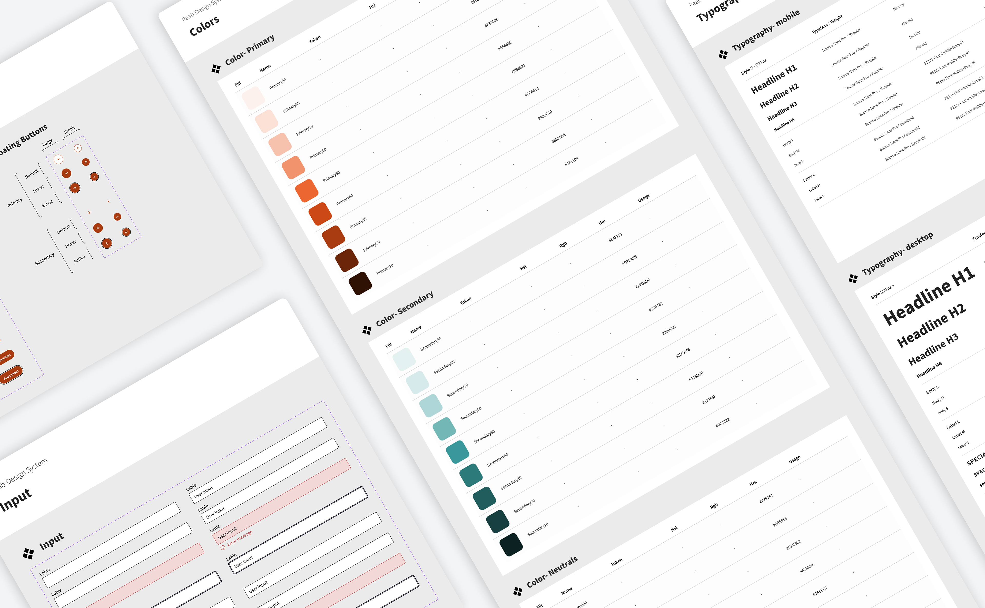
Design system
Outcome: a seamless and accessible experience
The redesigned website provides an intuitive, mobile-friendly user experience that enhances engagement and conversion. Improved navigation, accessibility, and consistency empower users to explore properties effortlessly while supporting Peab’s business goals.
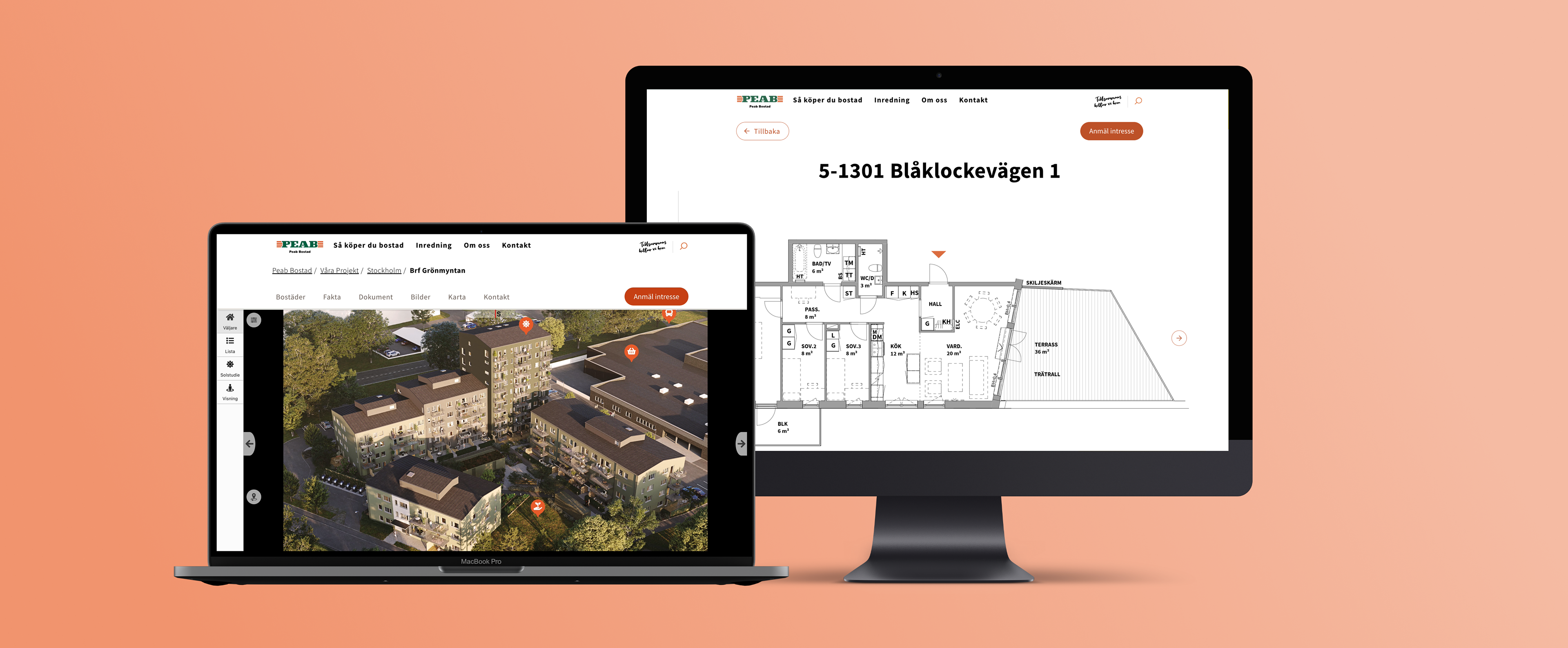
To enhance the user experience across all devices, we explored several options for implementing Peab's 3D property selector and other site features for mobile viewing. We chose to use a trigger to open the property selector in full-screen mode on mobile devices, ensuring faster loading and more intuitive interaction for exploring and selecting properties.
Following this decision, we implemented a responsive design to ensure accessibility and visual appeal across desktops, tablets, and mobile phones.
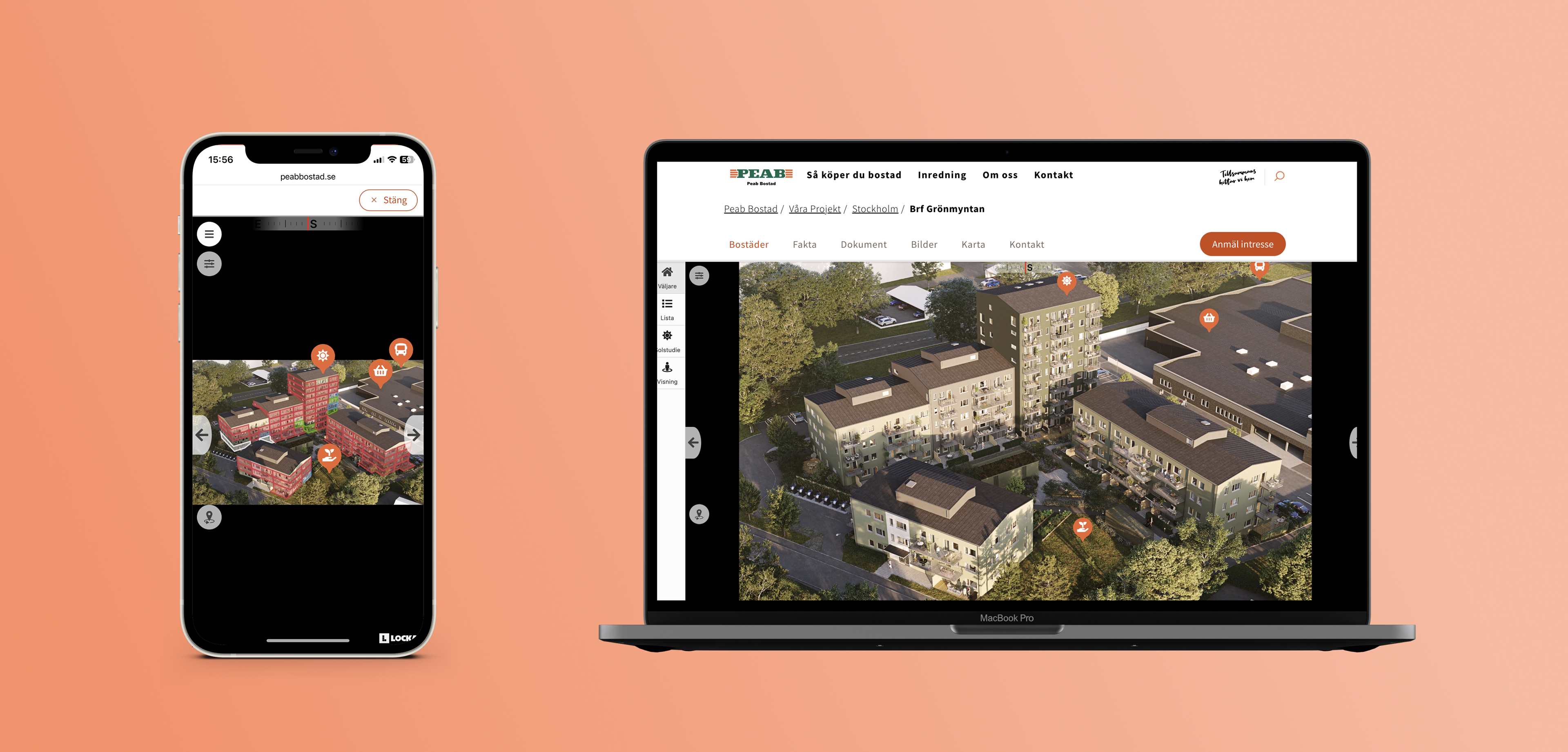
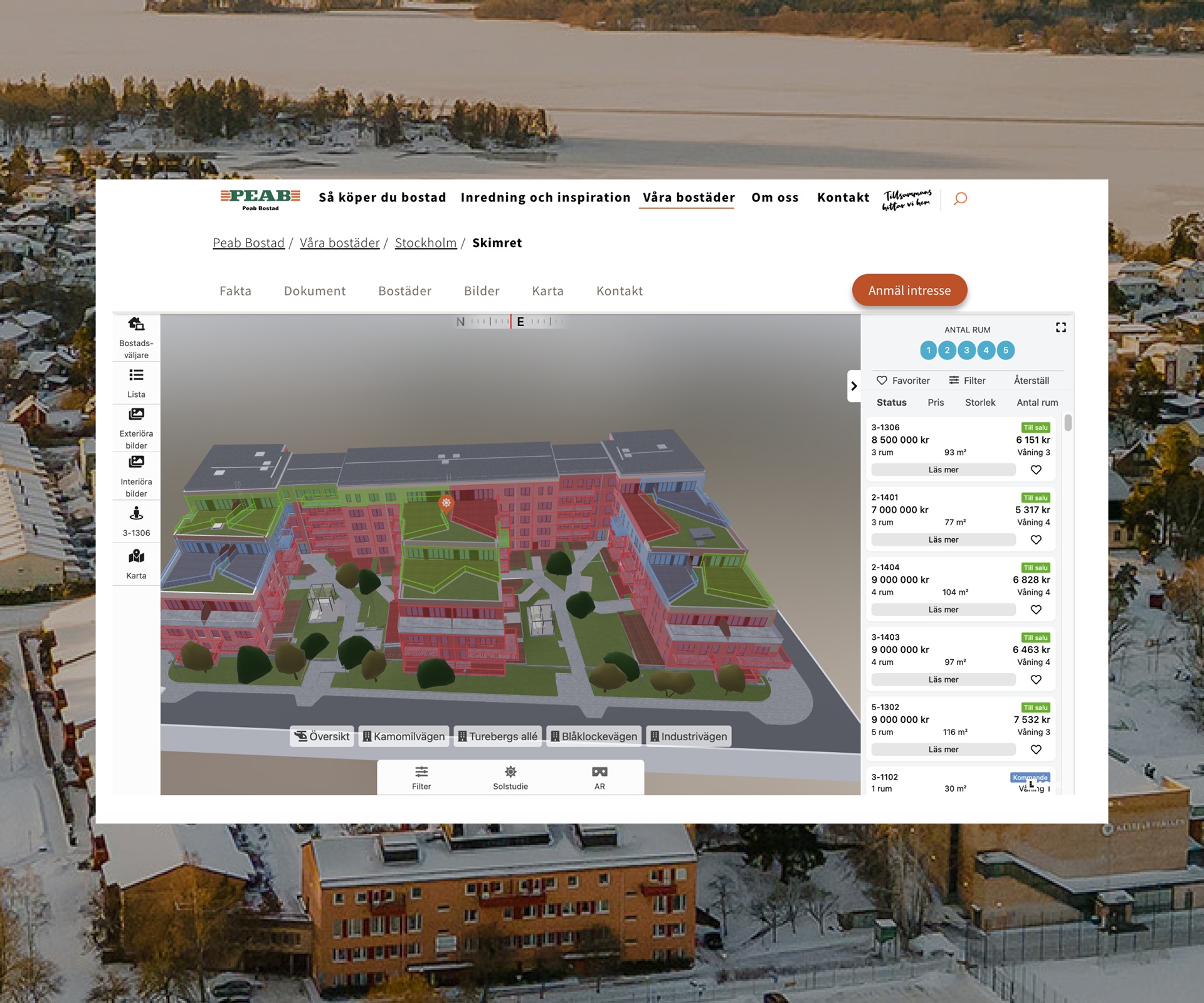
The 3D property picker features a tailored interface for different devices.
Enhanced information visibility
To make key features and information easier to find, I restructured the layout and introduced clearer signposting. Important content was surfaced at the right moments, reducing the need for excessive clicks or searching. This helped users access critical details quickly and efficiently.
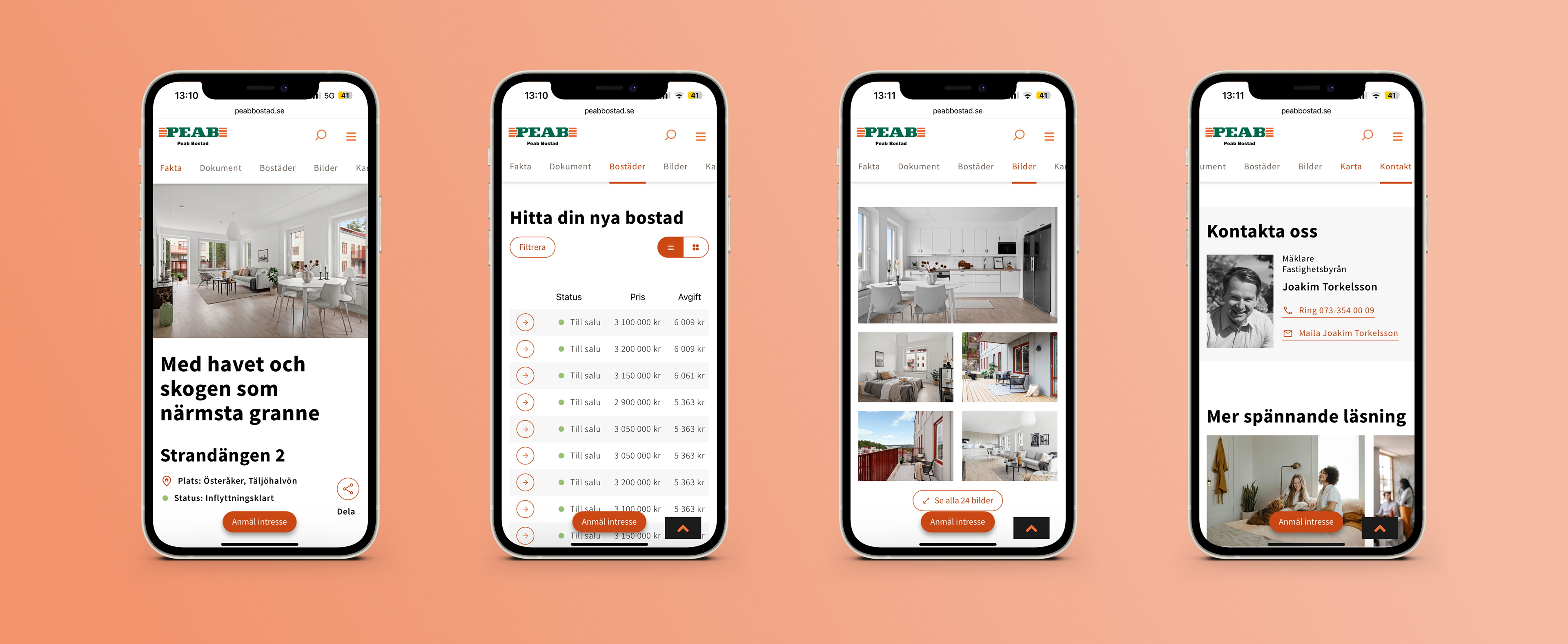
Example of project page
Clear differentiation between Project and Property Listings
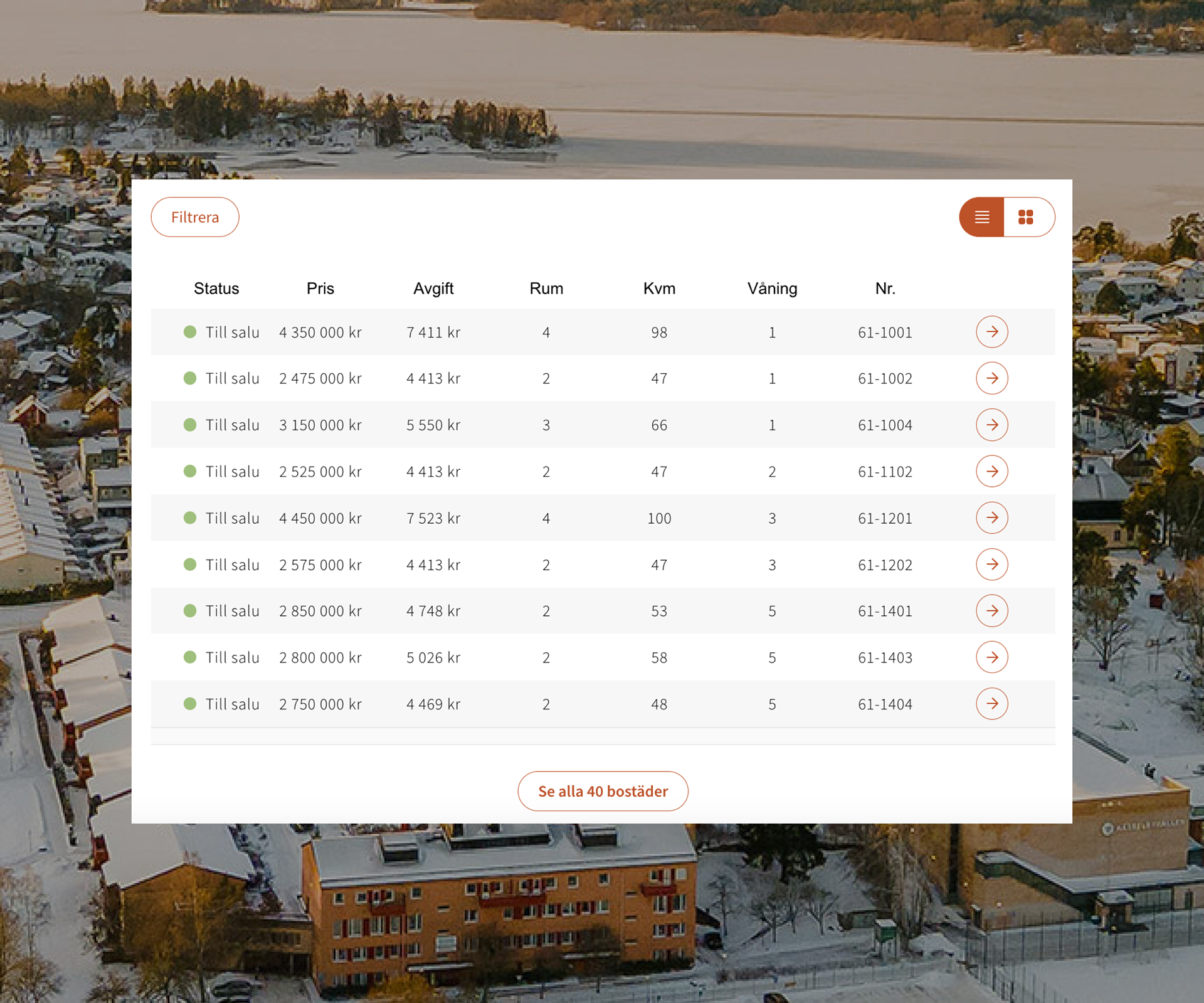
To resolve the confusion between project information and individual properties, I clearly differentiated them through content, visual design, and layout. I added a list view of properties alongside the 3D property picker on the project page, making it easier for users to compare properties at a glance. This ensured users always understood whether they were viewing a project overview or a specific property, improving orientation and reducing frustration.
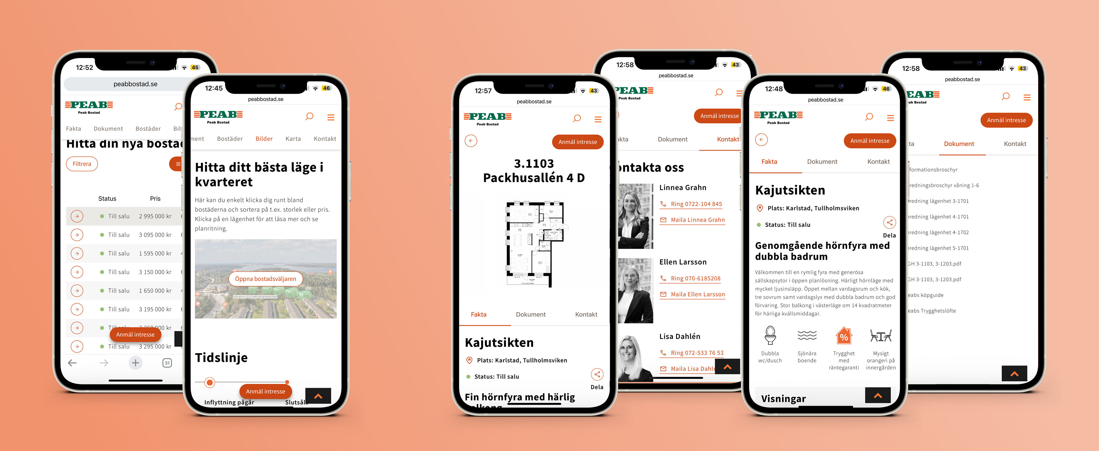
Example of a property list view and a trigger for the 3D property picker on the project page, and property details displayed in a modal.