Client: Urban Deli, 2022
Case Study: Redesigning Urban Deli’s website for a seamless user experience
Project scope
Urban Deli sought to create a more flexible and modern website that would inspire visitors, enhance user engagement, and improve conversion rates across multiple business areas. The goal was to consolidate their offerings—hotels, restaurants, stores, events, and catering—into a seamless digital experience optimized for both users and business objectives.
My role
As a UX/UI designer in an agile team, I was responsible for interaction design, navigation, and information architecture. I developed and tested concepts, created wireframes and prototypes, and conducted user research to optimize usability. Collaborating closely with developers, I ensured a smooth implementation and a seamless, accessible, and user-friendly experience.
The challenge
Urban Deli previously operated three separate websites (hotelwith.se, urbandeli.org, shop.urbandeli.org), each with inconsistent branding and unclear navigation.The outdated main website had usability and accessibility issues, hindered conversions, and made performance tracking difficult. With increasing competition in the food and hospitality sector, there was a critical need for a cohesive, user-friendly digital platform.
Research & Insights: understanding user needs
To gain a deep understanding of the current situation and to ensure a user-centered redesign, we conducted a comprehensive discovery phase:
• 26 qualitative interviews with customers and staff.
• On-site observations at Urban Deli's locations.
• Analysis of google analytics data to identify user behavior trends.
• Competitive benchmarking to gather inspiration from industry-leading websites.

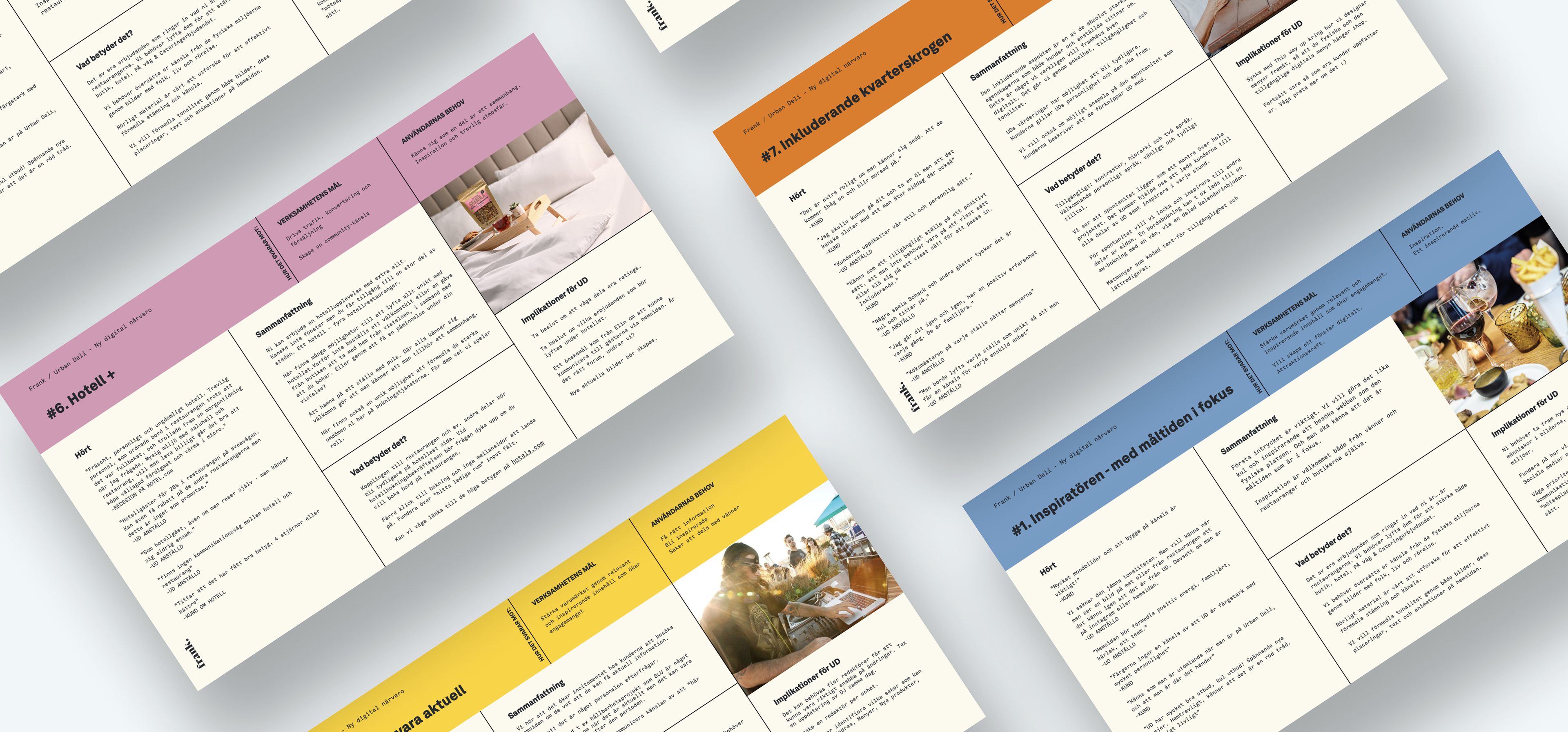
Example of research summary
Turning the research into actionable Insights
We analyzed the insights, defined key performance indicators and objectives, and structured the findings into a clear, actionable framework. Personas were developed to represent diverse customer segments, helping us better understand the needs and behaviors of different user groups. The team prioritized seven critical insights. To document each insight, a template was used that categorized them into various areas including "Business Objectives," "User Needs," "Customer Feedback," "Summary," "Implications for the Business," and "What it Means for the solution." The purpose of this categorization was to ensure that the implications of each insight were clear and understandable to all involved parties.
Examples of strategic hypotheses designed to guide the redesign, ensuring alignment with both user needs and business objectives:
• Simplifying website navigation will improve usability, reducing bounce rates and fostering deeper engagement with the content.
• Optimizing the booking process will minimize friction, leading to increased conversion rates and a more seamless user journey.
• Personalizing content for distinct user groups will enhance relevance, driving greater satisfaction, repeat visits, and long-term brand loyalty.
Insight analysis
From insights to solution
I started by developing multiple navigation concepts in low-fidelity wireframes and testing them with users to determine the most intuitive structure. The concept that best aligned with users' mental models was selected, forming the foundation for the site's core structure.

Example of insights from navigational concept testing.
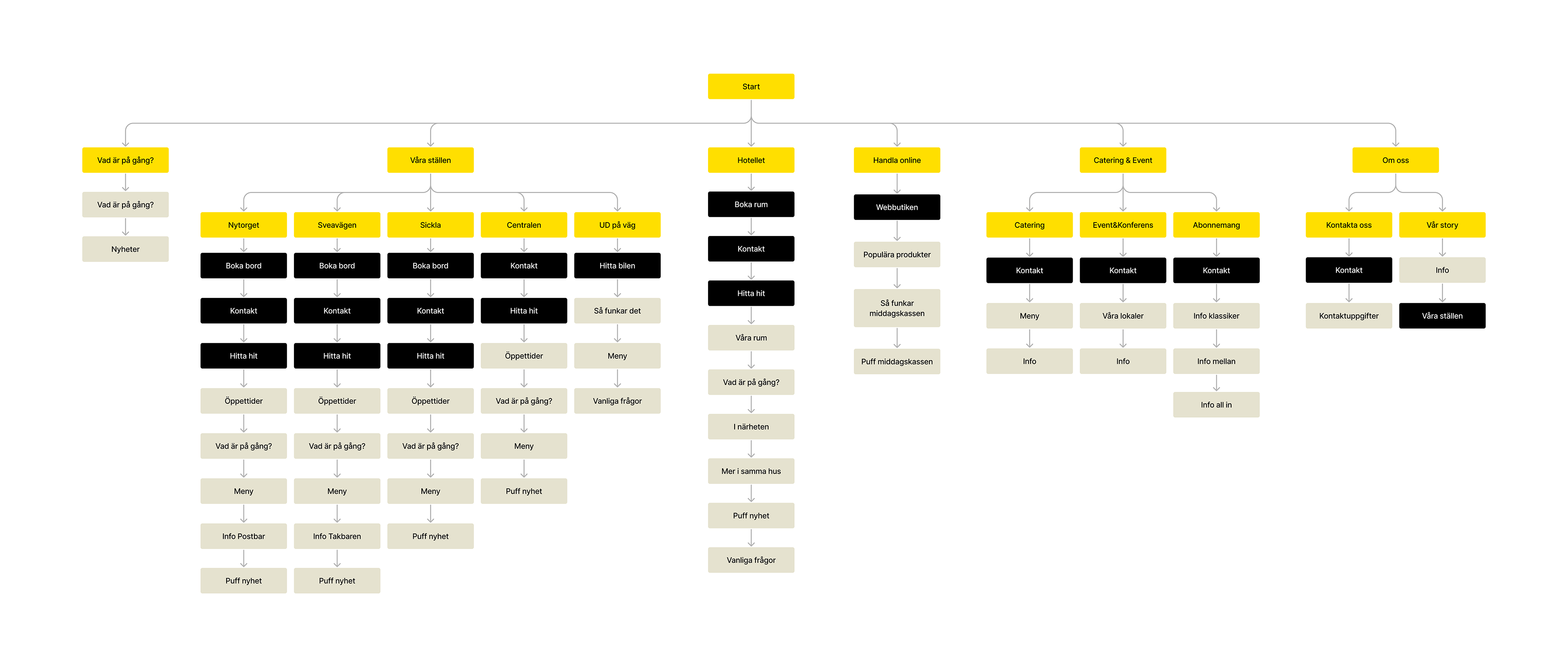
Site map
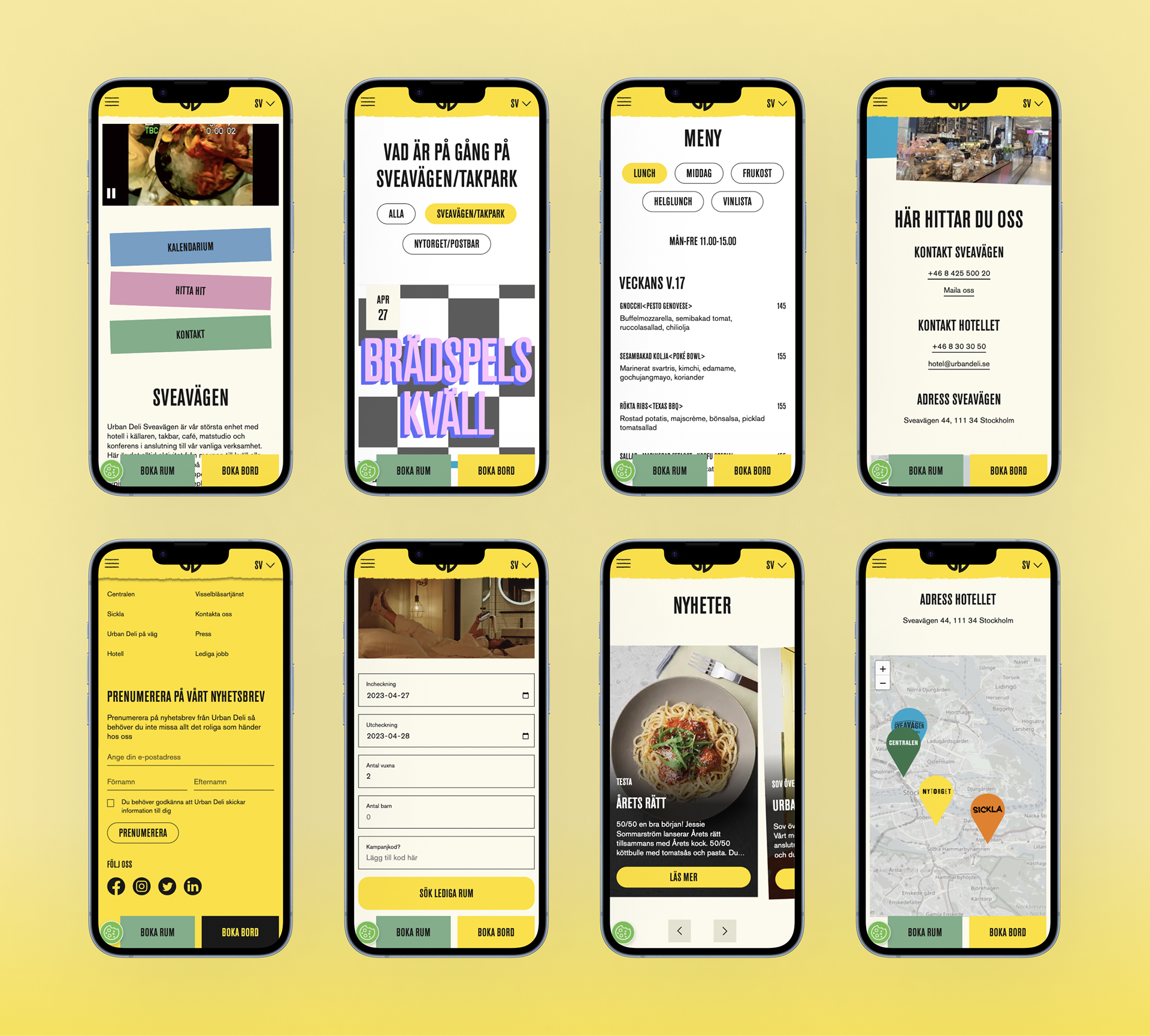
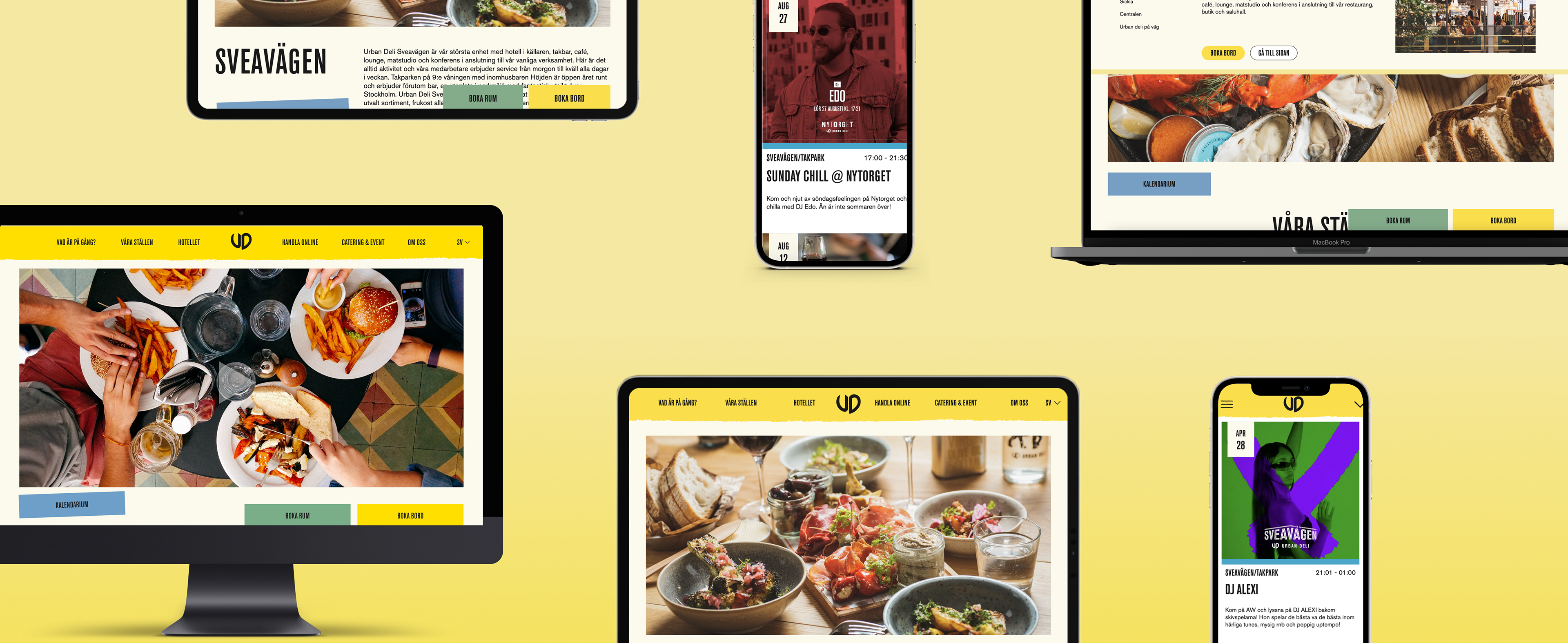
From there, I progressed to high-fidelity prototyping, incorporating detailed visual design, functionality, and content tailored to user needs and goals.
To ensure usability and effectiveness, the prototype underwent user testing, focusing on key areas:
• Navigation structure: Were the navigation headers clear and intuitive? Could users easily find what they needed?
• Information architecture: Did users grasp Urban Deli’s diverse offerings? Was it easy to locate details on hotels, restaurants, stores, or events?
• Usability: Was the interface intuitive and user-friendly? Could users complete tasks like booking a room or making reservations seamlessly?
• Call to Action (CTA): Were key CTAs clear and compelling? Could users easily find and engage with them?
Prototype

Example of summary from usability testing
Based on the analysis of user testing results, we identified several areas for improvement. One key challenge was users' difficulty navigating to the external online store due to unclear content and CTAs. To gain deeper insights into how users perceive category organization and product assortment, we conducted a card sorting activity with 12 participants. This activity aimed to establish the most intuitive groupings and category names for the main links and shortcuts on the online store. To address these findings, we designed a dedicated landing page featuring clear links to the external Shopify store, complemented by inspirational content and teasers to enhance engagement.
The Outcome
By implementing an user-centered, data-driven approach, we successfully launched a more flexible, accessible and engaging website for Urban Deli. The results, measured four weeks post-launch, highlight the positive impact of the redesign:
+55.31% Increase in Average Engagement Time (from 35s to 54s), indicating stronger user interest and content relevance.
+23.07% Increase in New Users, demonstrating improved discoverability and SEO effectiveness.
+11.31% Growth in Engaged Sessions, confirming higher-quality traffic and user engagement.
+8.39% Increase in Visitors from Stockholm, aligning with the brand’s target market.
Mobile-first success: The most significant improvements came from mobile users, validating the decision to prioritize a responsive, mobile-friendly experience.